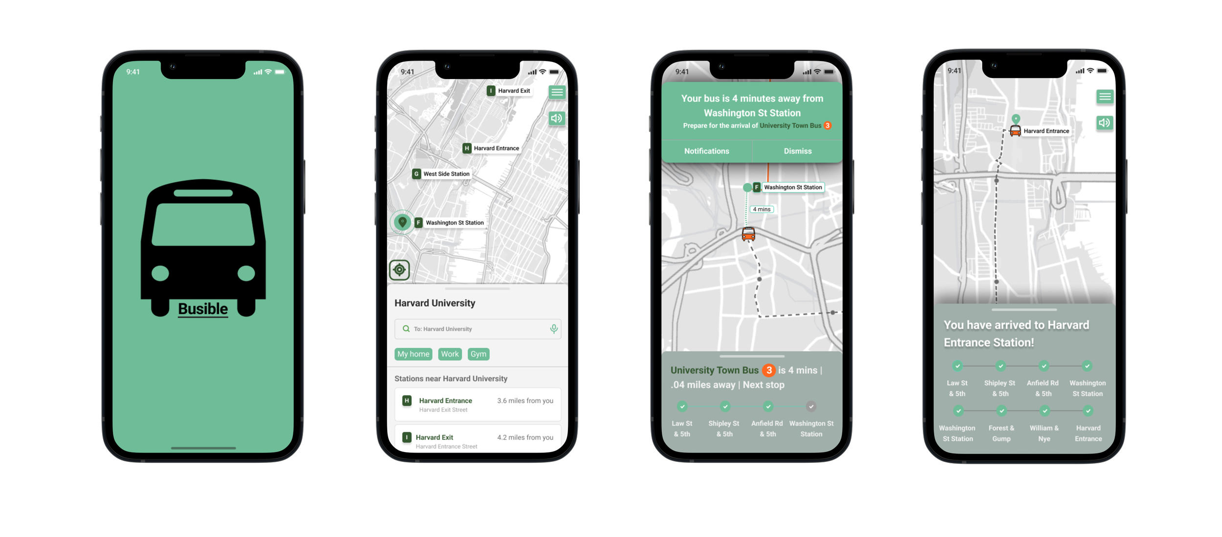
Busible. The most convenient bus app.
Overview
Busible is local transit app for a midsized transportation agency. Due to expansions there have been numerous bus routes that have been added, with many having the same bus stop. The addition to a new hub in which 7 bus lines coincide further increased the need for a new and improved app for its users.
My Roles: Research, Analysis, User Flows, Information Architecture, Sketching, Wire framing, Prototype, UI Design, Case Study
Problem
Traditional transit systems can leave a user waiting for a bus that may or may not have already passed its posted time, leaving users in rush or stranded. Old interfaces also create confusion and are hard to read and with the addition of new stations that contain multiple stops there is a need to improve the user experience
Project Length: 1.5 Months
From: November-December 2022

Solution
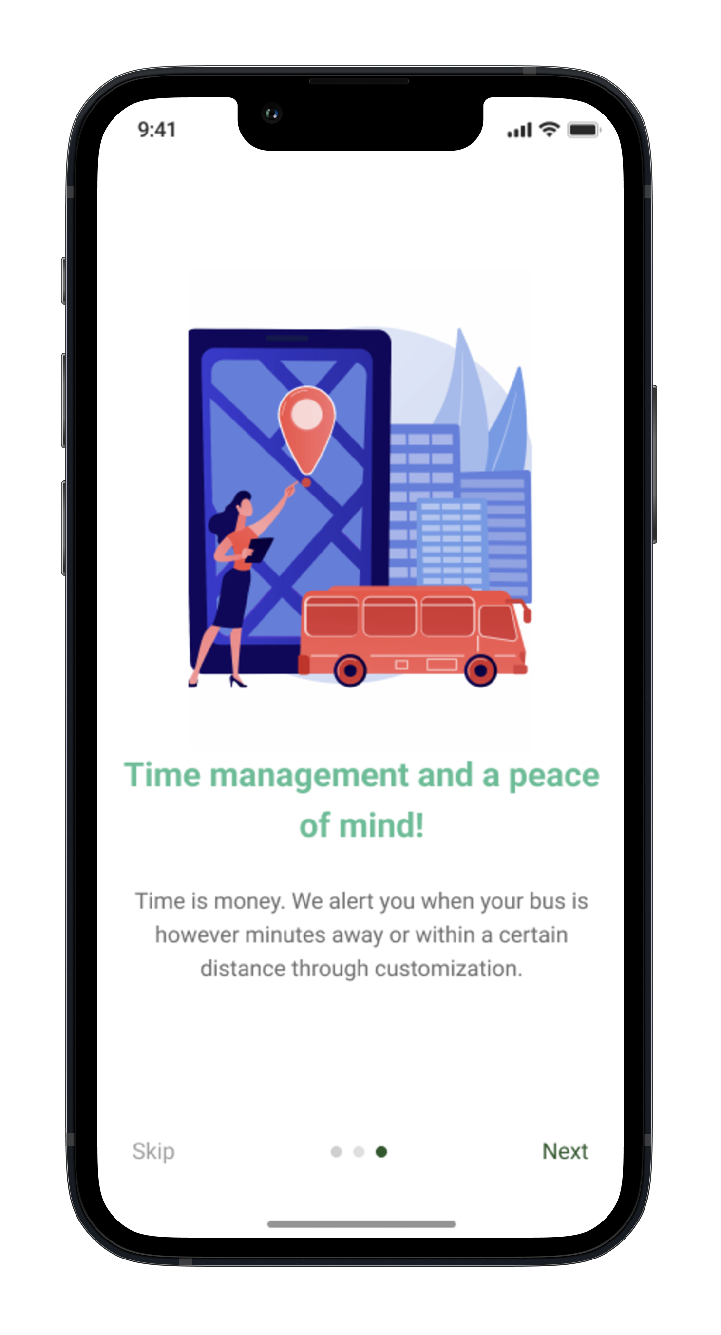
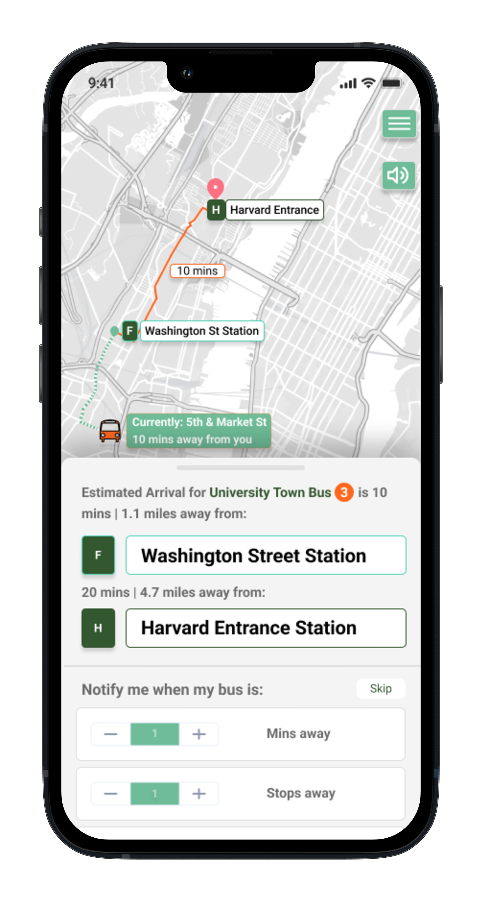
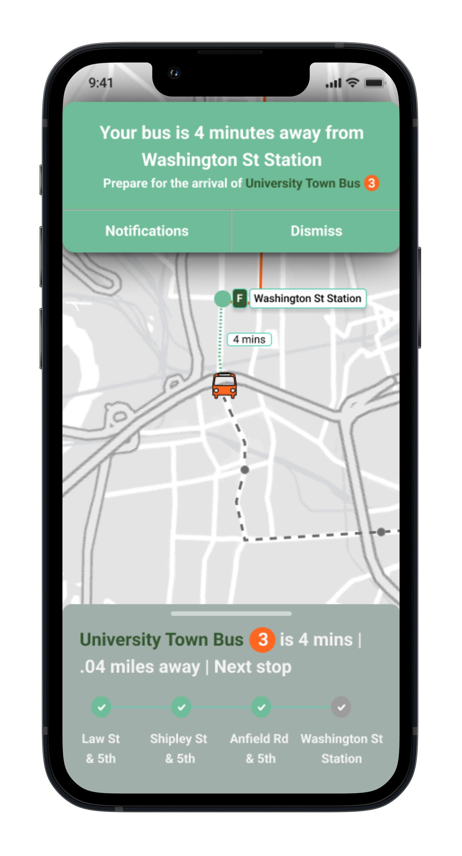
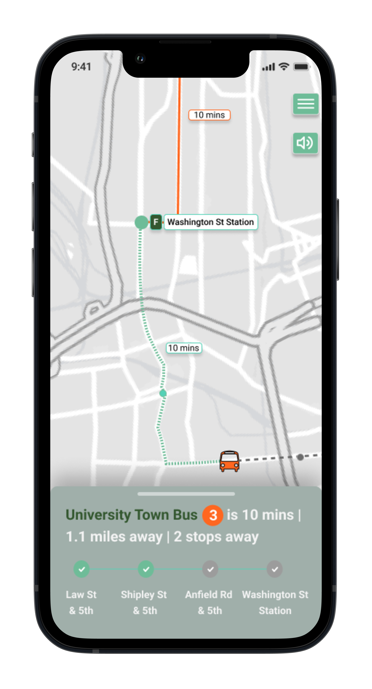
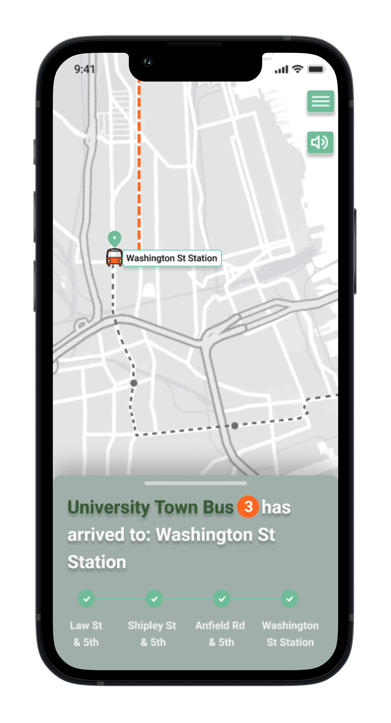
Empower the user. Users want more control over their journey from start to finish. Busible gives users the ability to track their bus live, create custom alerts, save favorite destinations, stations, buses, etc. Users can also see future bus times in advance, giving a peace of mind when preparing for a trip.
Quantitative
I created a Google survey form and received significant statistical data. This allowed me to better understand user behaviors:
33 participants
Survey was taken by users on multiple social platforms and shared with my personal network
User Research
Understanding the user
Qualitative
Understanding bus rider’s emotions, expectations, desires and fears was also essential in the development of Busible. A series of 1 on 1 interviews allowed me to understand their behavior, experience, tendencies, likes and dislikes:
3 users interviewed
Use the bus to commute to work or don’t have car
Conducted over video calls
Discovery and takeaways
It was found that 50% of participants were under 21 years old, indicating that a strong digital presence is essential to the success and growth of the local transit system.
The most frequent users were of ages 18-25, these users were either students or workers of various professions and use the bus as a means of commute.
By far the biggest complaint from the users is not having the ability to track the bus live and inaccurate arrival times, creating distrust and unfamiliarity.
30% said that they have abandoned taking the bus at some point due to frustrations with the older app
User Research
User Personas

Frustrations:
Not being able to track bus causes constant rushing
Goals:
Graduate and get a finance role closer to home

Frustrations:
Lack of trust in bus times and no current ability to save favorite buses/stations and create alerts
Goals:
Graduate in 2 years and purchase a car

Frustrations:
Not being able to see future schedules and lack of accessibility
Goals:
Retire in 3 years and explore the city more
Competitive Analysis
Current Market Standards

Google Maps is an excellent navigation app that informs drivers as well as transit users, including trains.Very intuitive with many options to get to a destination. It’s weakness is that it’s too robust for a bus commuting app.
Citymapper is a great transit app that covers buses, bikes and ferries. Intuitive with a lot of features, which is it’s strength and its weakness- one too many features for a bus app. Great colors.

Great color patterns and journeys are very intuitive and easy to use. It also allows the user to track their ride live, a main goal for Busible. Provides users with suggestions. Nice menu layout and also shows what rides are nearby.
Wireframes
Sketching the frames of solution


Define
Architecture

After usability testing it was found that the users appreciated the thought of live tracking their bus, but it was also found that they wanted a design system that could show them WHERE in the journey they were at. “How many stops away til the bus arrives at my station? While en route how many stops away am I from the destination?” . From professionals to students, this iteration was very well received. Not only can we add trust and reliability for when a user waits for their bus to pick them up, but they can also feel free to study, read, watch a movie, chat with friends, draw, nap, etc while en route to the destination with the comfort knowing that Busible will let them know when they are close to the destination and have arrived. This goes back to the early solution of empowering the user while creating trust and reliability.

Digital Wireframes
Low Fidelity Solution
Prototype
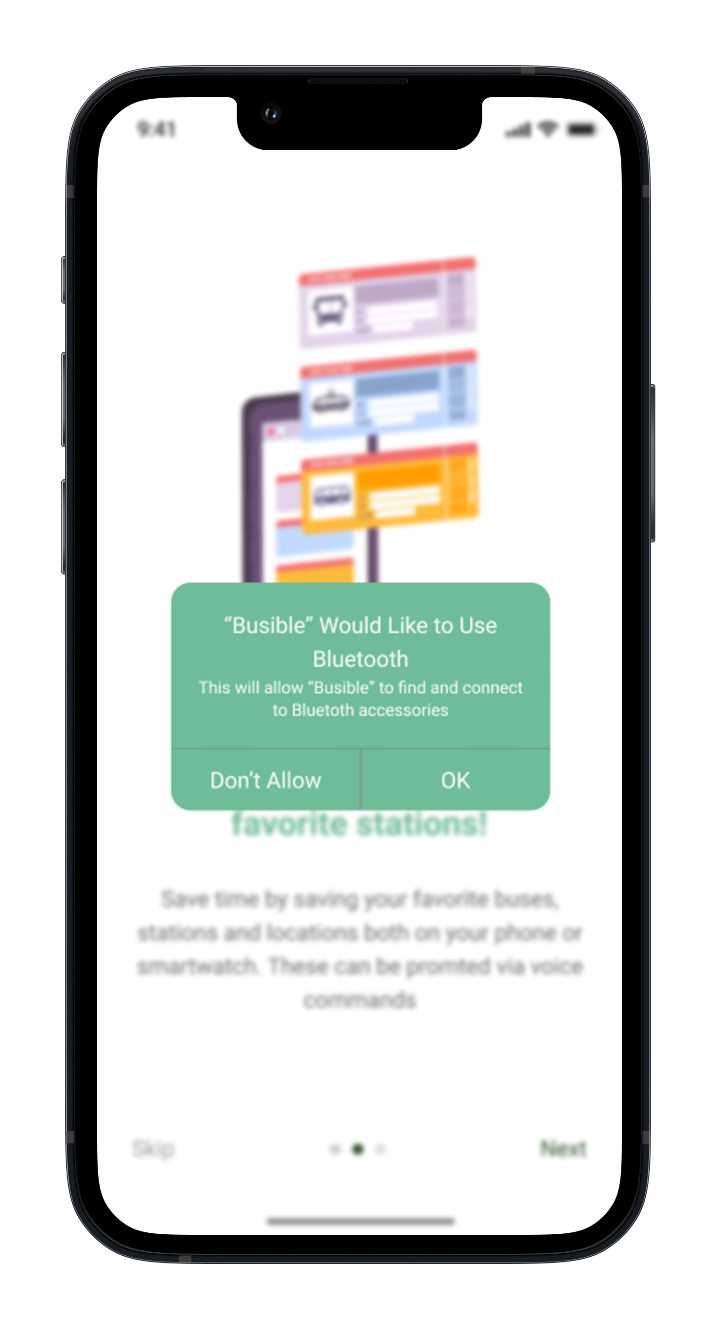
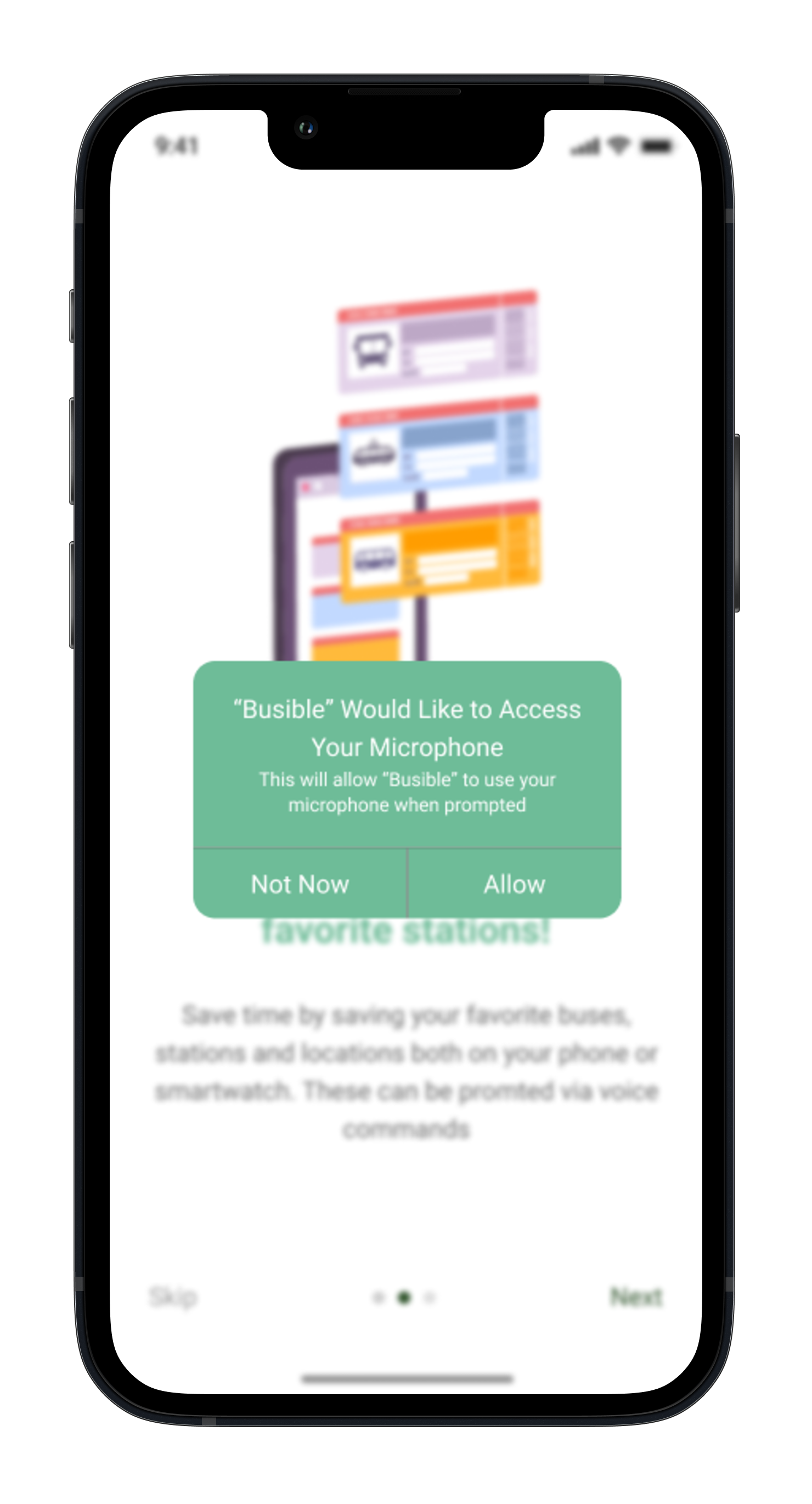
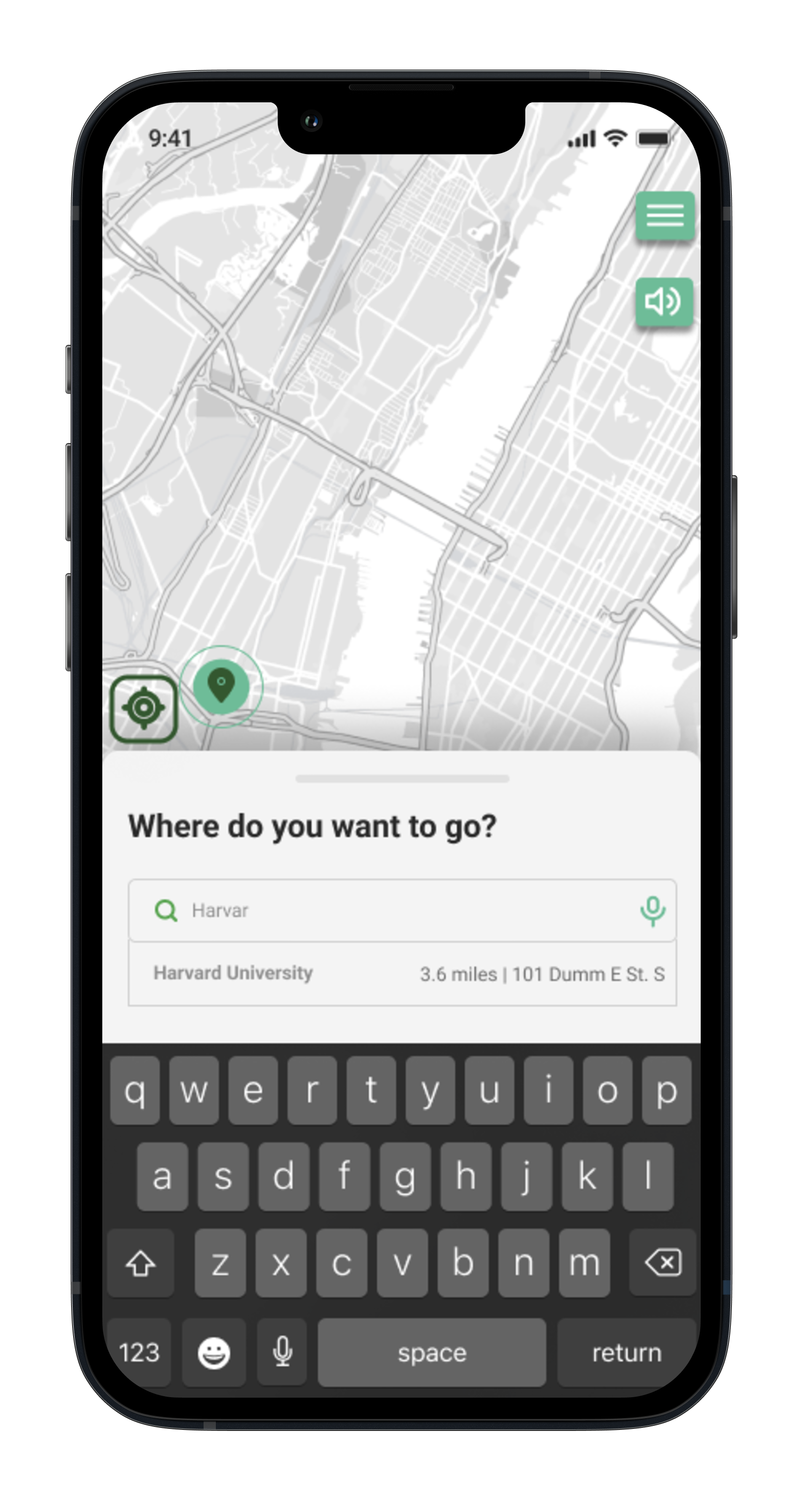
The Interface

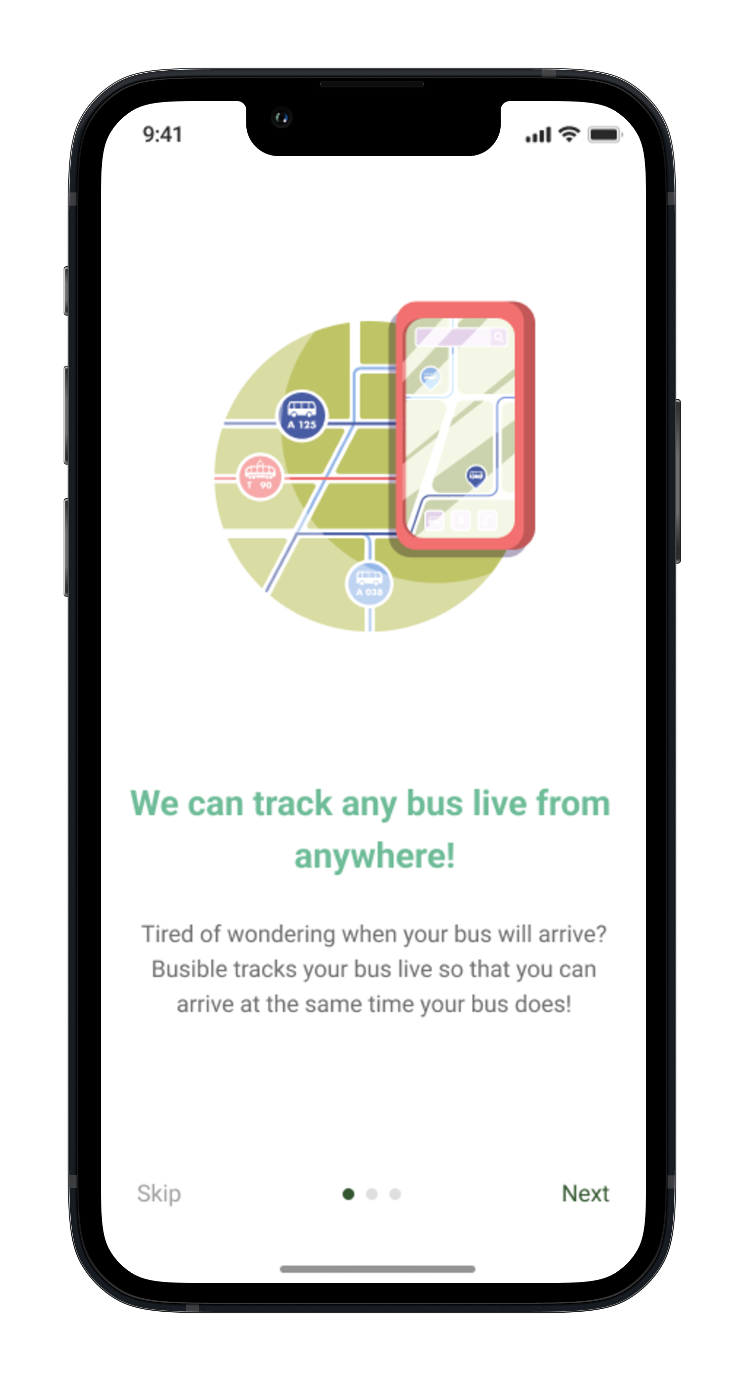










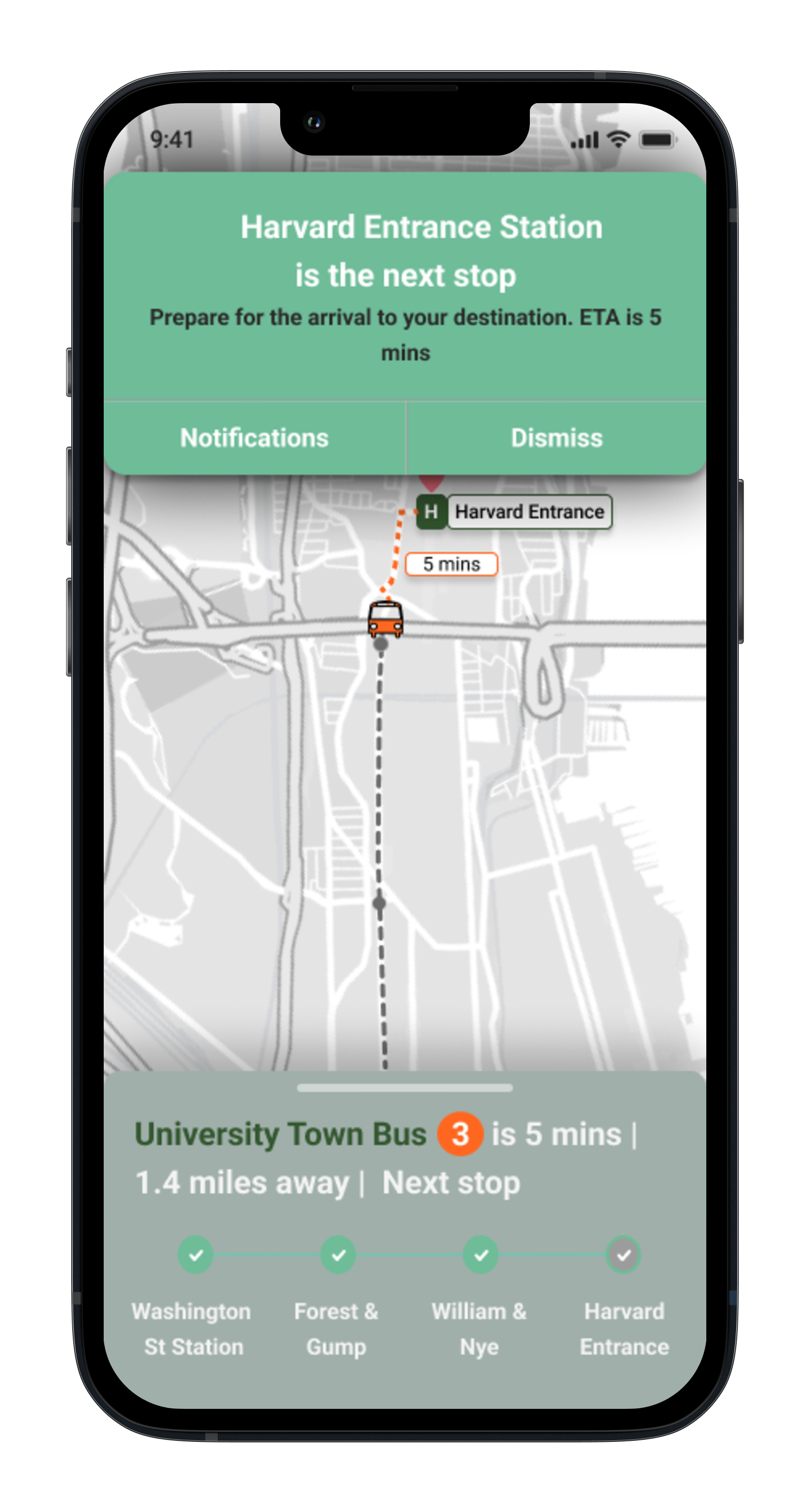

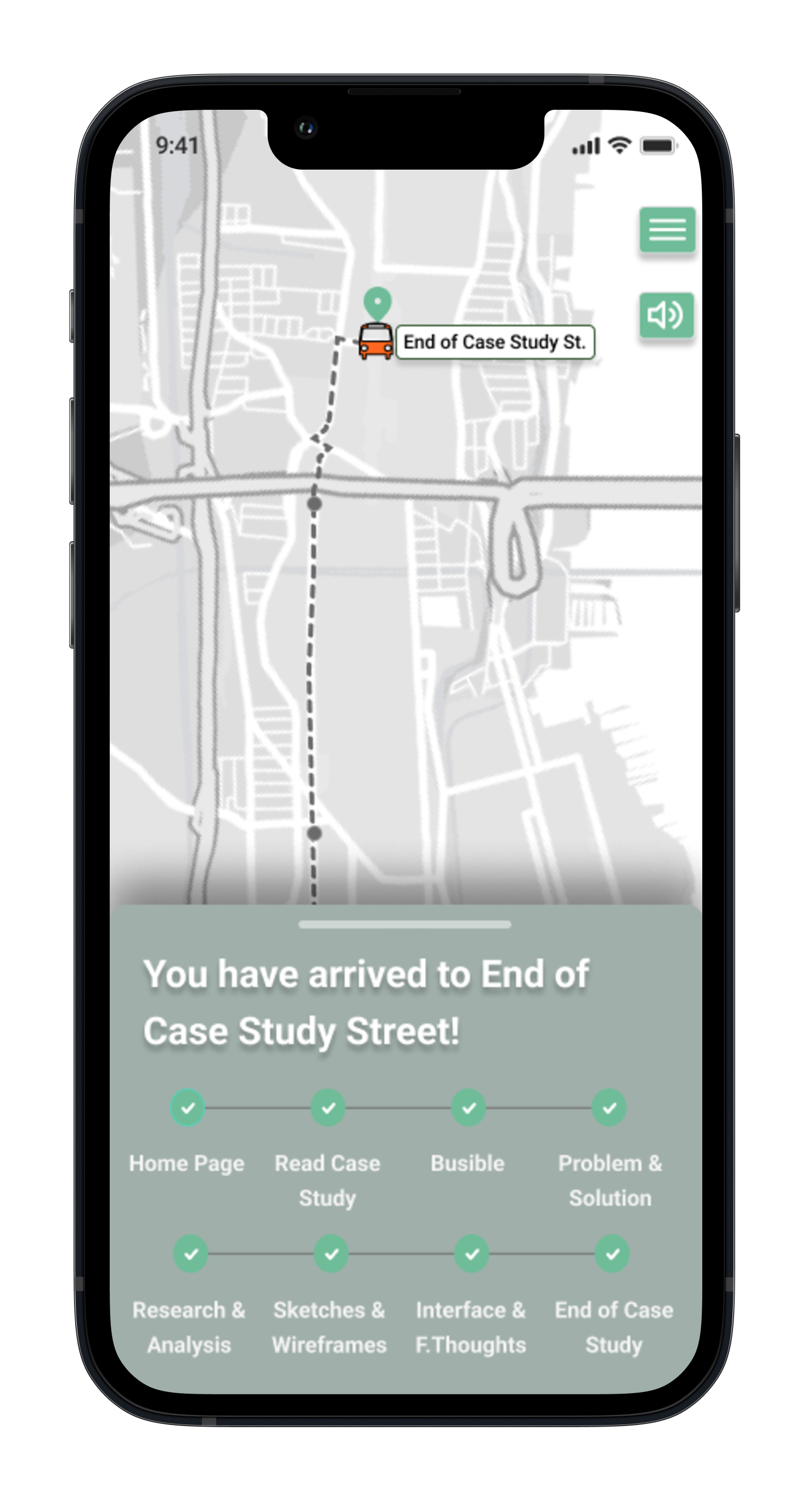
Color Pallet, Style Guide and Typography
The Brand


Lessons Learned
Final Thoughts
Being that this was my first ever UX project I learned many lessons along the way. The main one being to stick to the MVP and goals. Be wary of scope creep. Along the way you start getting many other ideas on how to create the perfect app, yet you have to focus on the reasons for why there was a problem in the first place and stick to the plan. Valuable time was lost due to random ideas that had no real value to the goal of the user, hence reminding one that this is focused on the user experience and how to make it easier.
Document everything. Not only does this help keep you organized, but can save a lot of time when referring back to flows, personas, etc. This is tremendously useful for when it comes time to gathering insights and for the case study!
Organization. This goes hand in hand with documenting everything. This can be particularly easy to forget when learning the ropes and being in the midst of the rush that creating a product can cause. Being organized in Figma can save many headaches and time as one is working with hundreds, even thousands of components and moving pieces.