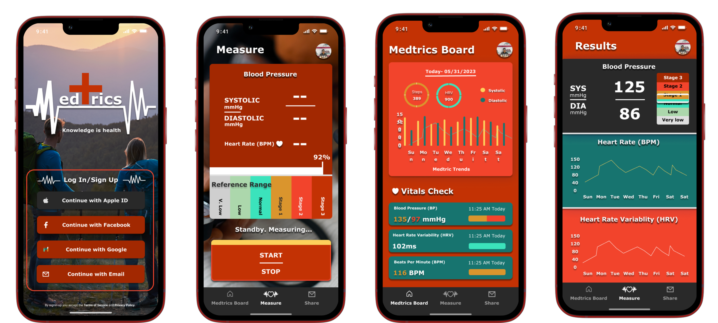
Medtrics. Knowledge is Health.
Overview
While the blood pressure monitors have evolved since their inception, the methods of measuring it have not changed. Many competitors only take into account blood pressure while ignoring other metrics that can steep someone towards a better well being. Medtrics offers blood pressure, heart rate variability and heart rate information and translates it into an digestible and informative manner for the user
My Roles: Research, Analysis, User Flows, Information Architecture, Sketching, Wire framing, Prototype, UI Design, Case Study
Problem
Tracking your health should not mean that one has to pay hundreds of dollars worth of doctor follow ups. With nearly 30 million of Americans being uninsured and the digital world becoming more accommodating for the user, it is vital that the market offer the user with a more convenient option to track their health. With the major competitors being well known brands the challenge is creating a UI to make simple tasks easy in the digital form and accessible. This also includes the ability to share a professionally formatted health report for the user to share not only blood pressure readings, but heart rate variability and heart rate. Translating what can be confusing was the biggest challenge.
Project Length: 1.5 Months
From: April-May 2023

Solution
The Medtrics App was created to give users the ability to track their health vitals via the use of a smart blood pressure monitor. Gone are the days of manually tracking your readings. With HRV and BPM readings this provides insightful trends are reported to the user who then can send it to their medical professional. Other med apps are complicated, making it inaccessible to other users who are new to technology. As the world becomes more data driven why shouldn’t the user be using data for their health?
Quantitative
I created a Google survey form and received significant statistical data. This allowed me to better understand user behaviors:
22 participants
Survey was taken by users on multiple social platforms and shared with my personal network
User Research
Understanding the user
Qualitative
Understanding the user’s emotions, expectations, desires and fears was also essential in the development of Medtrics. A series of 1 on 1 interviews allowed me to understand their behavior, experience, tendencies, likes and dislikes:
3 users interviewed
All have had high blood pressure
Conducted over video calls
Discovery and takeaways
It was found that 70% of participants were over the age of 25 years old, indicating that a simple and accessible app is essential.
55% of total participants have had high blood pressure at some point, with 60% having family history.
Users want easy to read results and interpretations. 95% of users that have used a blood pressure machine have had to manually write down their readings.
30% said that they have abandoned a health app due to not being able to understand readings
User Research
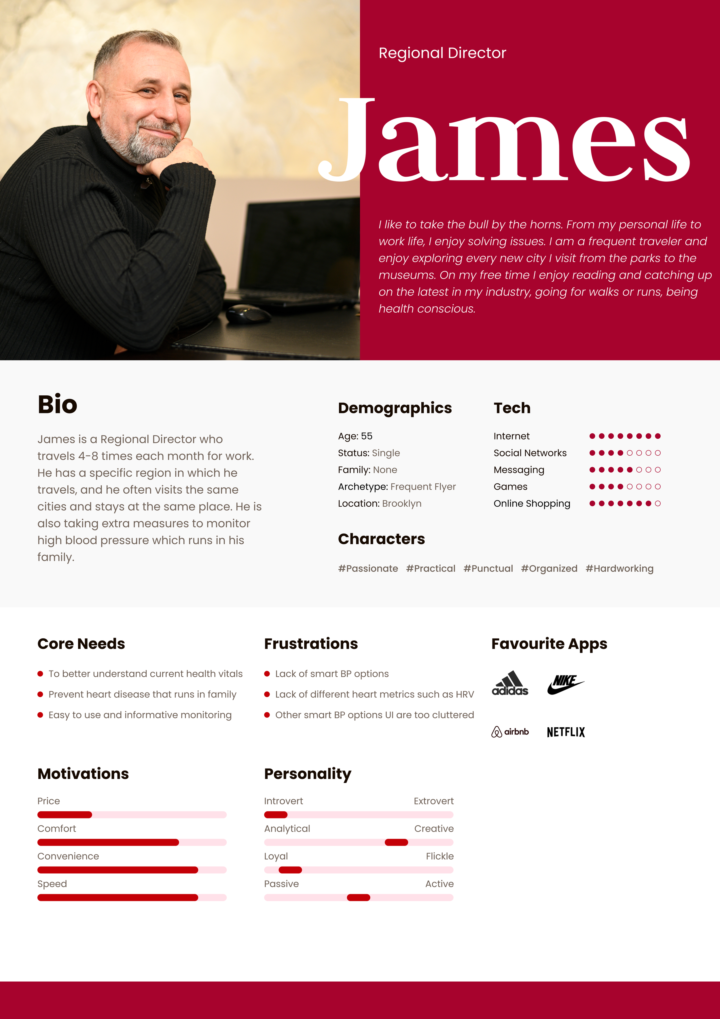
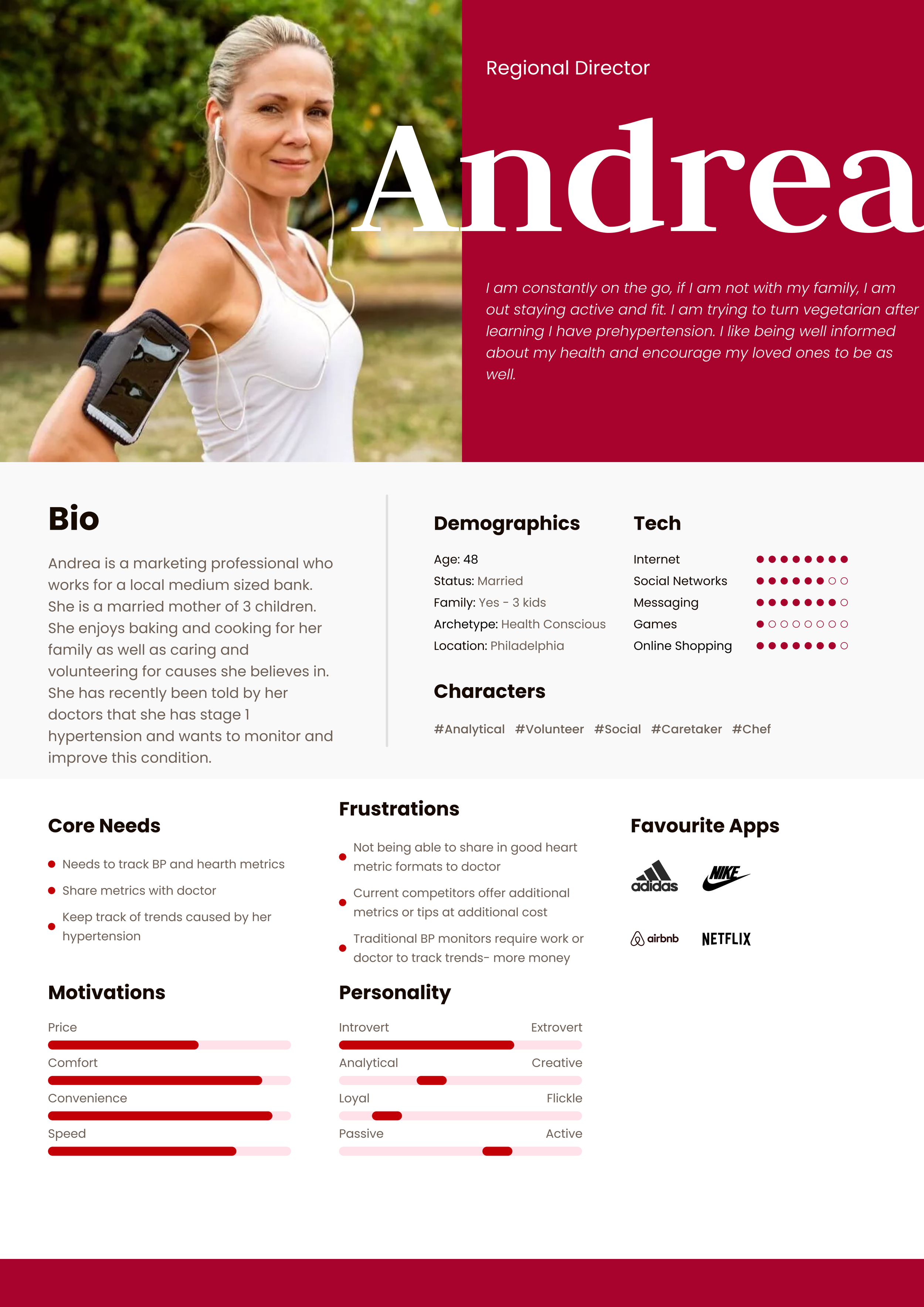
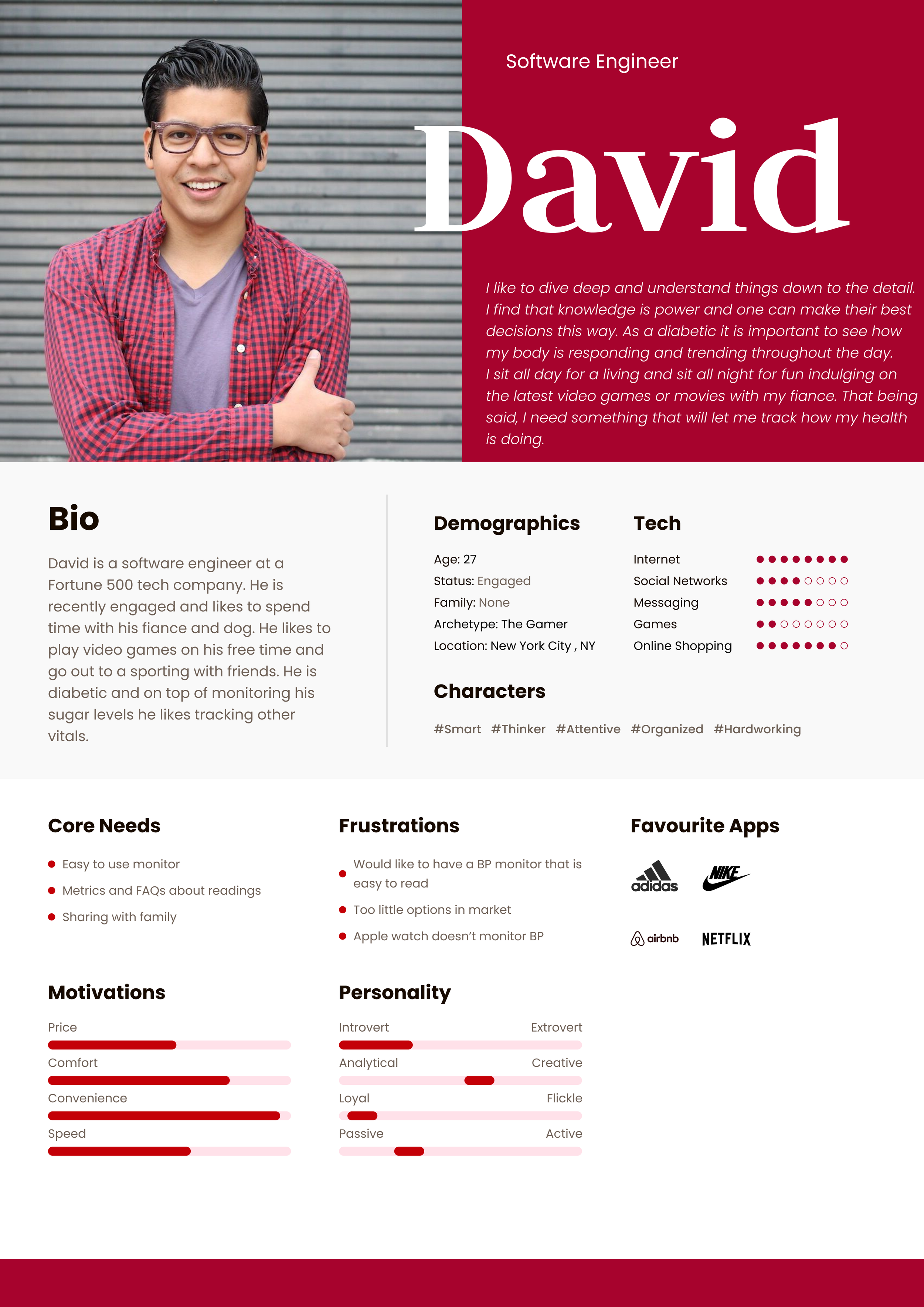
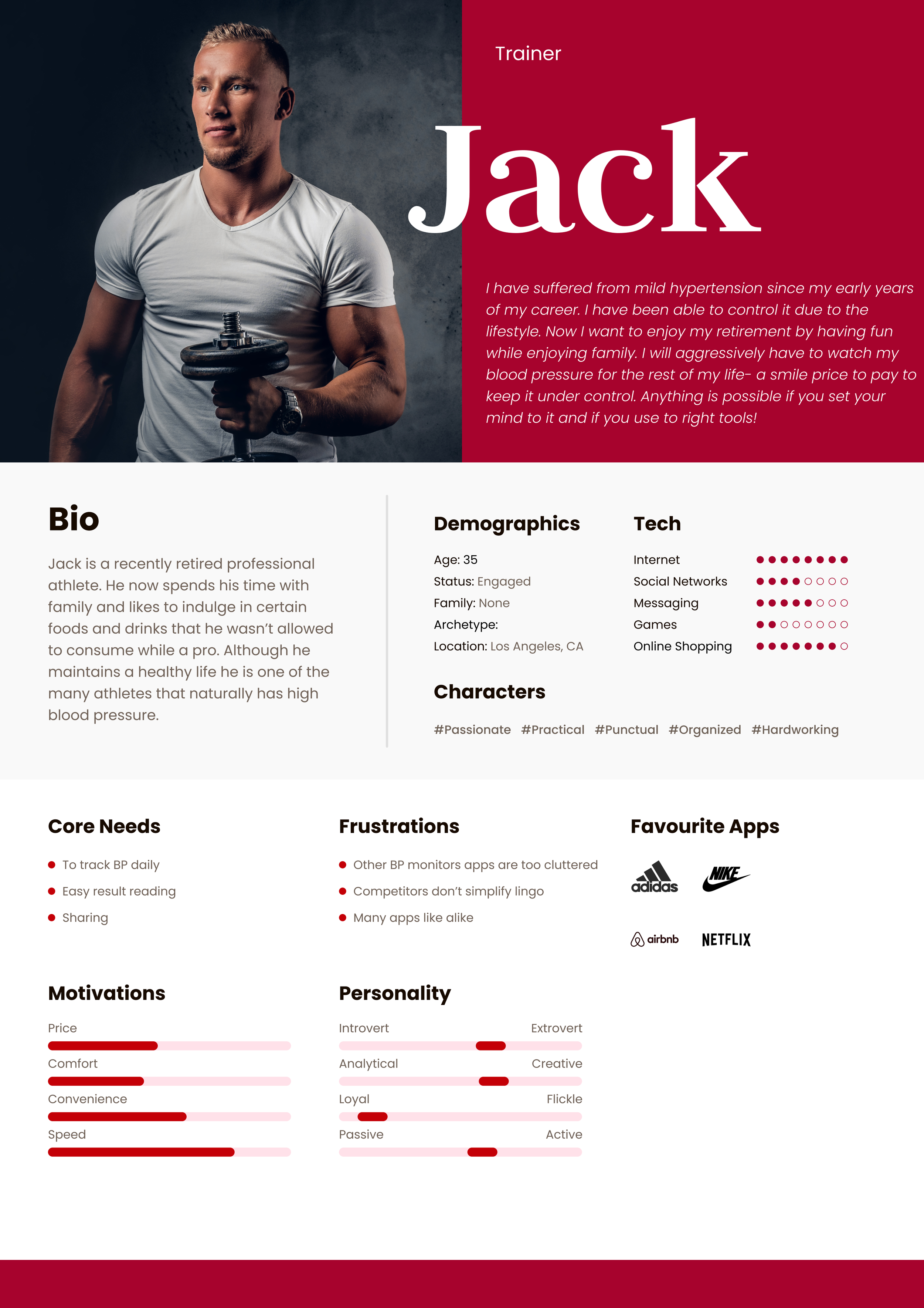
User Personas
Competitive Analysis
Current Market Standards
Google Maps is an excellent navigation app that informs drivers as well as transit users, including trains.Very intuitive with many options to get to a destination. It’s weakness is that it’s too robust for a bus commuting app.
Kardia is also a useful app for tracking EKG and pulse. A simple UI with nice palette, this offers users data reporting and live med chats.

Apple Health can be used with smart watches, but it does not offer blood pressure readings. A user can add BP readings but manually. This tracks HRV and BPM in a easy to read manner.
Wireframes
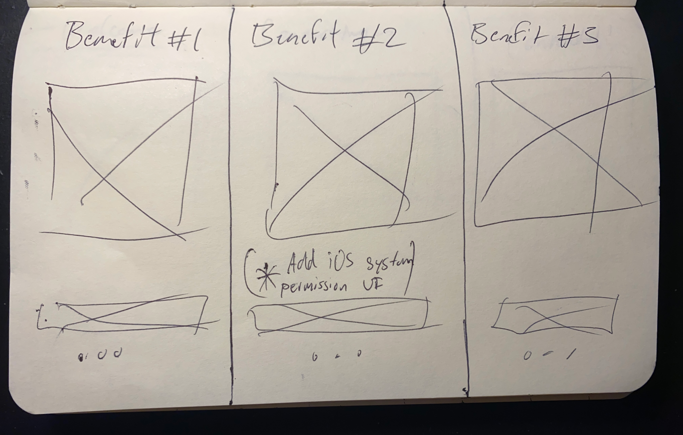
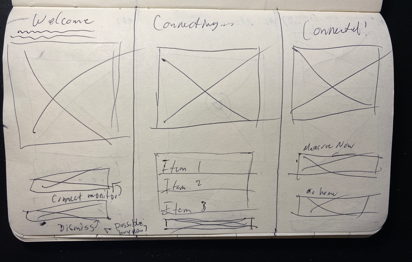
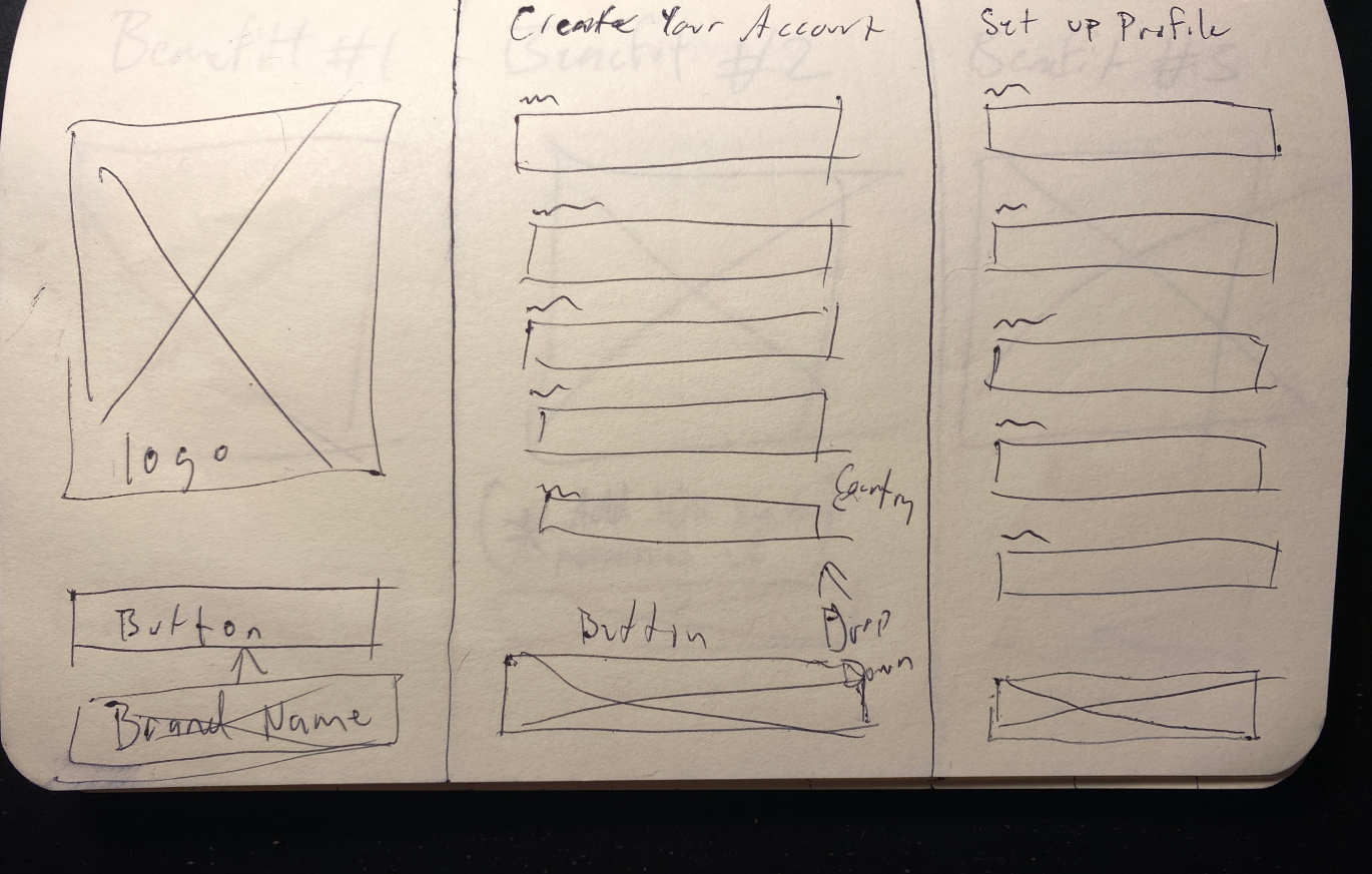
Sketching the frames of solution

Define
Architecture

After usability testing it was found that the users appreciated the thought making the sign up and starting process quick and easy. They also have mentioned that they would like to see some educational items on the app as medical terms are not necessarily common knowledge. This goes back to the early solution of empowering the user while creating trust and reliability.

Digital Wireframes
Low Fidelity Solution
Prototype
The Interface
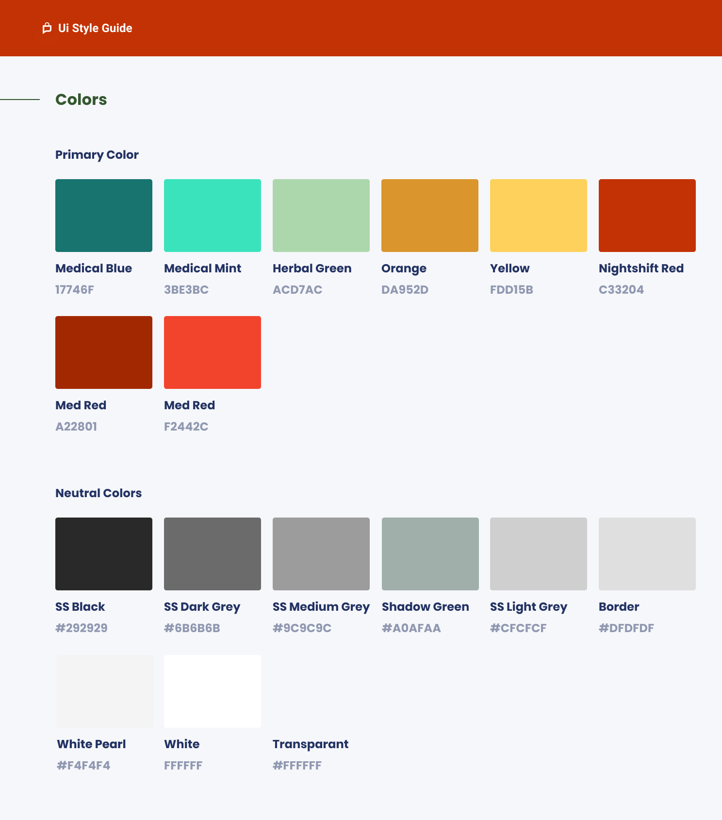
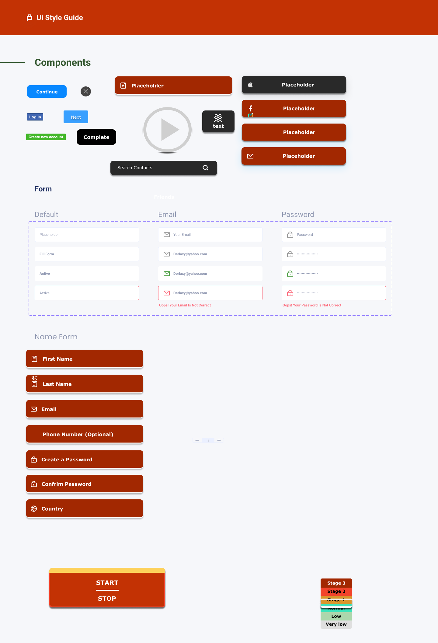
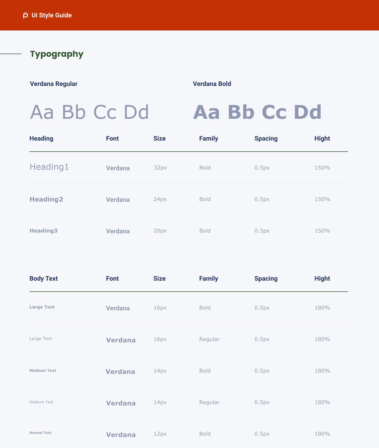
Color Pallet, Style Guide and Typography
The Brand
Lessons Learned
Final Thoughts
Document everything. Not only does this help keep you organized, but can save a lot of time when referring back to flows, personas, etc. This is tremendously useful for when it comes time to create your case study!
Organization. This goes hand in hand with documenting everything. This can be particularly easy to forget when learning the ropes and being in the midst of the rush that creating a product can cause. Being organized in Figma can save many headaches and time as one is working with hundreds, even thousands of components and moving pieces.
There have been many takeaways from this project. One is that keeping organized is essential. When you have sprints and sessions planned out there is no other way of keeping great progress and momentum on the brainstorming and creativity needed for building an experience from scratch.
Another is thinking outside of the box to give the user something they didn’t know they might’ve needed, this can be difficult when also trying to remain in scope and on time, not steering away from the MVP. Having a solid grasp on this early in a UX career I believe is very beneficial.